updated personal brand
Project summary
This project is all about refreshing my personal brand, Natalie Rose. I originally created my brand back in undergrad, but as I’ve grown as a designer and social media marketer, I knew it needed an update. My new brand reflects who I am now and my vibe—modern, creative, clean, and elegant. This project includes a new logo system, color palette, font pairings, brand aesthetic, and an updated version of my website and social media look.
Age: 20–35
Gender: Mostly female
Important Traits: Creative, social-media savvy, aesthetic-driven, and possibly looking to hire a designer or collaborate.
Target Audience
My old brand no longer felt like me. It was too basic and didn’t show off my full personality, skills, or style. I wanted something that matched the kind of work I’m doing now and the kind of work I want to attract—something professional but not stiff, with a strong aesthetic and identity.
Problem statement
I started from scratch with a full brand audit. I made mood boards, played with logos, fonts, and color palettes until I landed on a look that felt right. I created a flexible brand system that could work across my website, resume, social posts, and anything else I create. I also redesigned my website to match this new look and made sure everything felt consistent, elevated, and true to who I am.
The solution
This brand glow-up helps me present myself with confidence. It feels cohesive, thoughtful, and more like me. My goal was to use this brand refresh as evidence of how I’ve grown as a designer in just one year. Whether someone finds me through my socials or visits my site, they’ll immediately get a sense of my style, skills, and personality. It’s a brand I’m proud to stand behind.
The impact

Business System design process
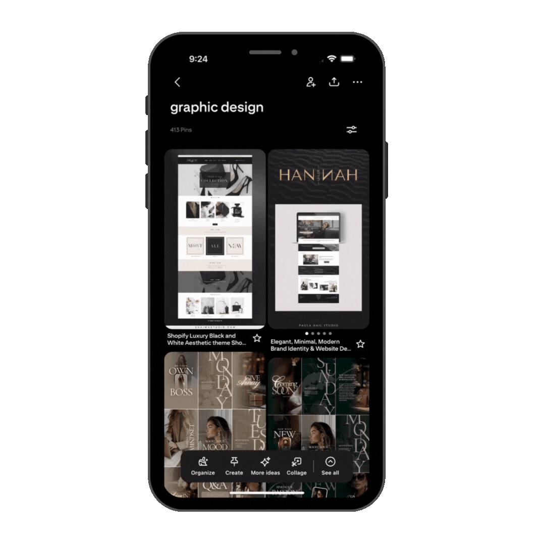
Moodboard & Inspiration
I pulled inspiration from brands and designers with modern, simple, and feminine aesthetics. I looked at logo layouts, color palettes, and branding that felt elevated but approachable.

logo development
I explored ways to combine “N” and “R,” experimented with accents (like the stylized Ó), and played with layout ideas. My goal was a sleek, balanced mark that could stand alone or work with text.
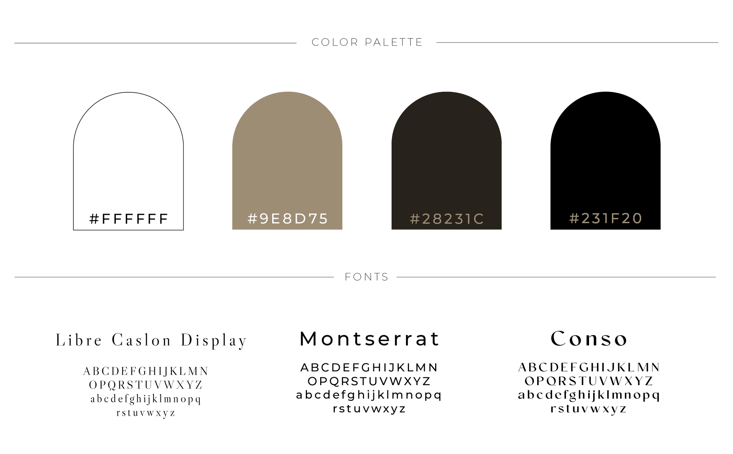
color & typography
I chose a soft, modern font pairing and leaned into a color palette with neutrals and browns—my favorite colors and a strong part of my personality and design voice.

brand system
From letter heads to business cards, I created a set of assets that are clean, consistent, and adaptable. I focused on spacing, type hierarchy, and balance across all applications.
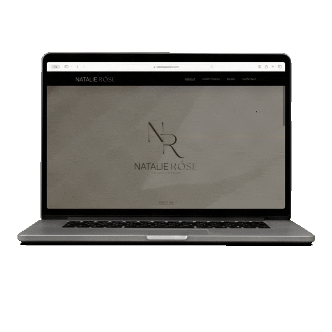
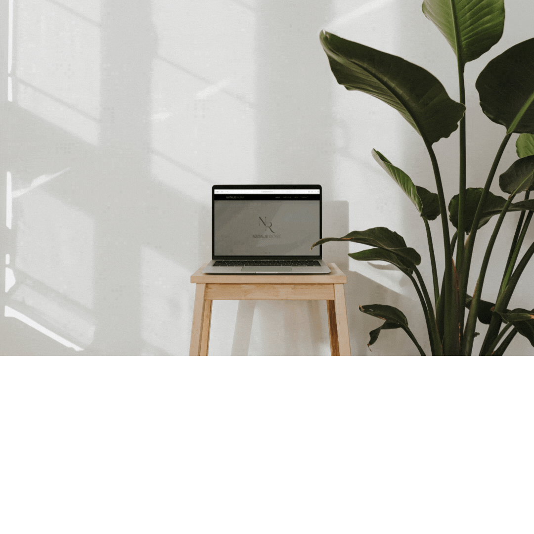
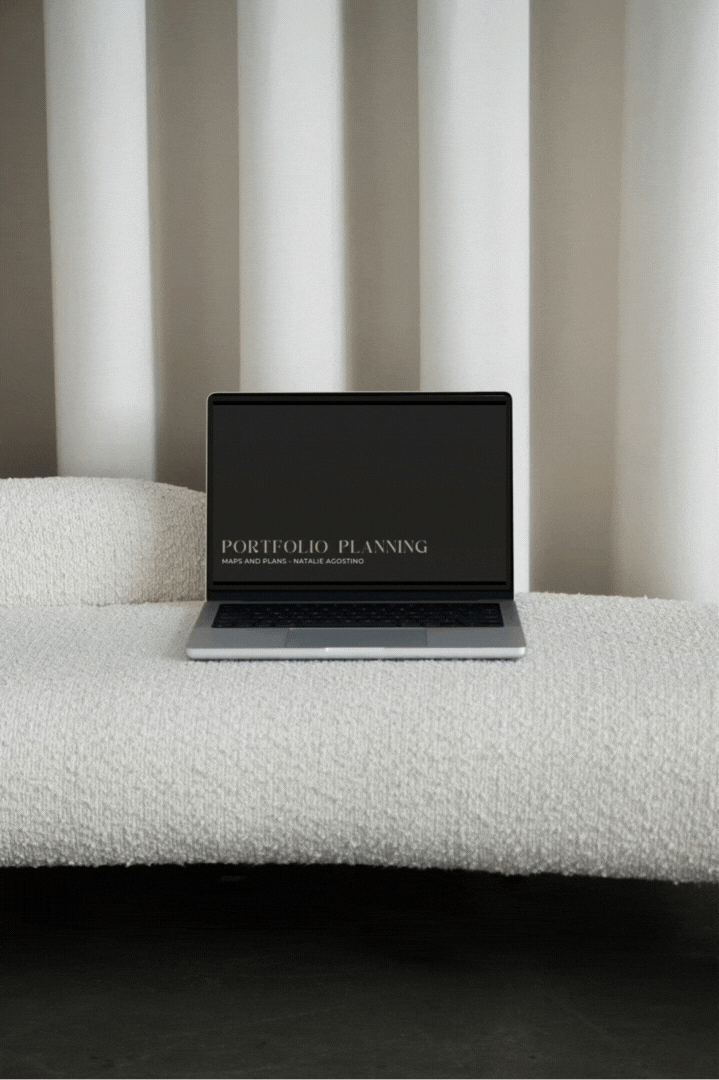
website refresh
I updated my personal website to reflect my new brand, improve navigation, and create a better user experience. My blog, contact page, and project layout all now reflect the updated visual identity.
Before vs. After: Brand Evolution
Below are comparisons between my original brand and my updated brand, showcasing how my skills, style, and design strategy have evolved.
Basic logo with minimal variation
Neutral, somewhat generic palette
Limited type styling and spacing
No real brand "tone" or system across platforms
Original Brand Highlights
Refined logo system with intentional styling
Bold, modern color palette featuring red as an accent
Clear font hierarchy and cohesive layout
Brand system that works across print, digital, and social
Personality and polish that reflect who I am now
Updated Brand Highlights
Final Product
Final Product

LOGO

Moodboard

business card

“Thank you” card

Letterhead

resume